Before I provide you this year’s update on the data, it has come to my attention that I need to clarify a few things.
- The hypothesis of “more guns = more deaths” is not my hypothesis, claim, or allegation. In point of fact, it is the underlying, foundational argument of every “gun control” organization in the country, and I am simply accepting it, at face value, for the sake of examining it.
- I am not setting out to prove any causation. In other words, I am emphatically not making the counter-argument that “more guns = fewer deaths”. Such a claim would require a lot more work and study than I am willing to put into these posts, unlike those aforementioned “gun control” organizations, who are more than willing to perpetuate easily-believable falsehoods in order to line their pockets and unjustly limit your rights.
With those caveats made as explicit as I can, it’s time to give y’all the update to last year’s post. So, with another year’s data under our belt, is the hypothesis of “more guns = more deaths” accurate?
… not so much.
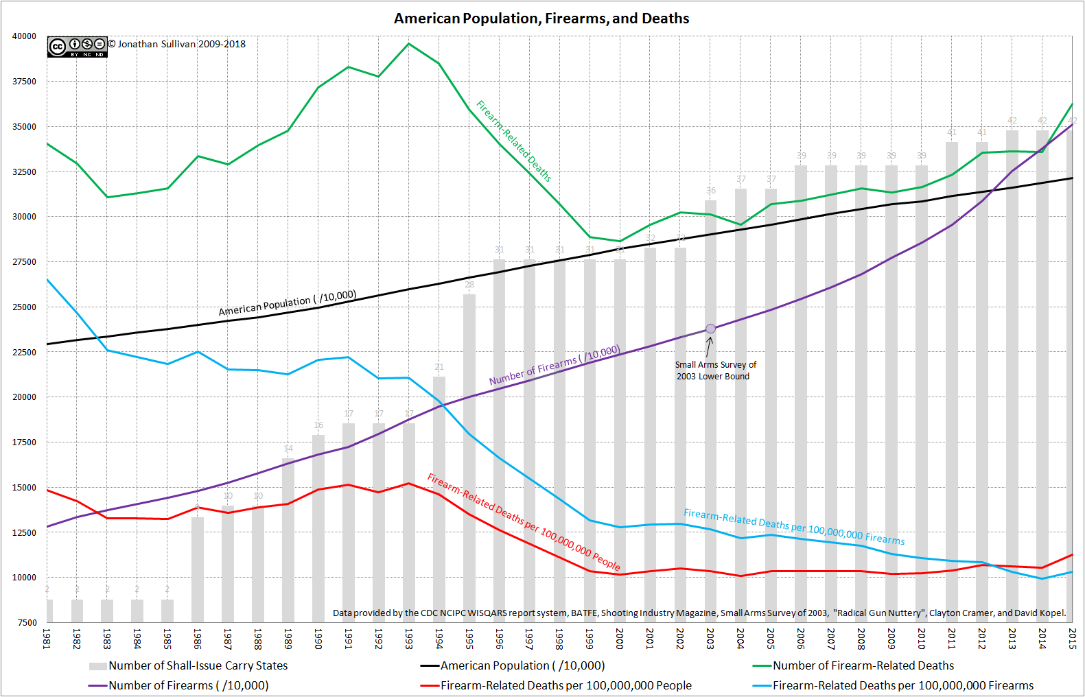
There was a surprising uptick in firearm-related fatalities in 2015, but over the course of the 34 years tracked, the trend remains mostly the same.
The number of firearms per capita and the number of firearm-related fatalities per capita correlate with a coefficient of -0.74808 – indicating a very strong, but negative, correlation between the two data sets.
The number of total firearms and the number of total firearm-related fatalities correlate with a coefficient of -0.17420 – indicating a significantly weaker, but still negative, correlation.
As students of statistics remember, correlation does not prove, or even indicate, causation, but correlation is a requirement for causation. In other words, given that neither the rates nor the raw numbers are positively correlated, then the increase in firearms in the country over time cannot be causing an associated increase in firearm-related deaths.
In simpler terms, the hypothesis of “more guns = more deaths” remains false.
(The first post in this series, wherein I spell out the above caveats differently, but I thought fairly clearly, is available here. The source Excel spreadsheet from which I generated the above graphic and numbers is available here, should anyone care to check my work. As always, my sources are the CDC’s WISQARS Fatal Injury Reports (for firearm-related deaths and the US population), the Small Arms Survey of 2003 (for a starting point from which to calculate the number of firearms in circulation), the BATFE’s Firearms Commerce in the United States (this time the 2017 edition, and for the number of firearms produced/imported), the Shooting Industry News (for firearm production numbers before 1986), and Radical Gun Nuttery (for the number of shall-issue/Constitutional Carry states in the Union).

Excellent, as always — thank you!
LikeLike
Happy to help :).
LikeLike
Unfortunately, your real data will be ignored.
When the gun control crowd wants to make a point, your facts just get in the way.
LikeLike